Emily peña
COLOR PHOTO JOURNALS
.


complementary colors
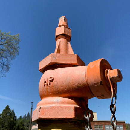
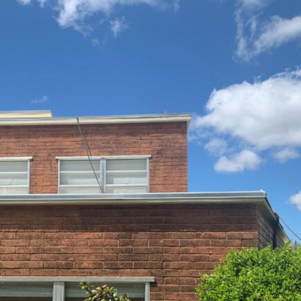
For this photo journal, the purpose was to find complementary colors. The first photo shows an orange hydrant (I'm pretty sure it's a hydrant) with a bright blue background; the second, yellow and purple flowers; and the third and fourth showcase grass next to a red (albeit faded) curb.
.


complementary colors
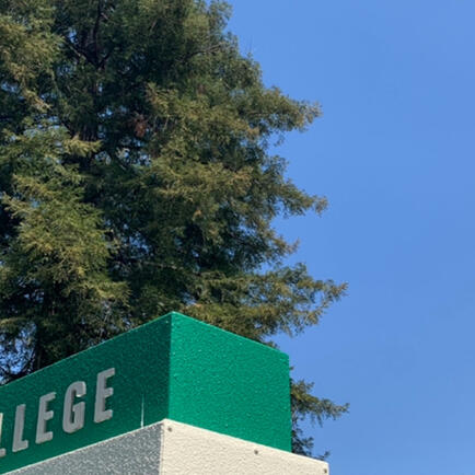
For this photo journal, the purpose was to find analogous color schemes. The top left photo shows an analogous color scheme of orange, red-orange, and red. The top right photo has the red of the sidewalk, the orange at the top of the hydrant, and the yellow at the bottom. The third photo has dark green at the bottom, yellow-green in the middle, and lighter yellow-green at the top. And finally, the fourth photo has green in the tree and grass, green-blue on the sign, and the blue of the sky.
.


warm and cool colors
The purpose of this photo journal was to find warm and/or cool colors. The first photo has both, with the warm orange of the bricks and the cool blue of the sky; the second is also warm, with red leaves; and the third and fourth are cool colors, with green leaves and trees in the third and the blue sign and blue sky in the fourth.
.


the instability of color
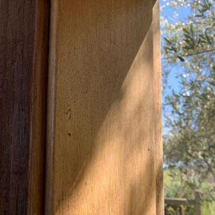
The purpose of this photo journal was to show how light affects color. The first photo, top left, shows how the part of the bush that's in the shade appears to be a darker green than the part in the sunlight. The second photo, top right, shows how the wood becomes a much darker brown in the shade. The third photo, bottom left, shows how the red becomes more dark and vibrant in the shade than the red in the sunlight. The fourth photo shows how the colors change in artificial light (top) and natural light (bottom).